OK HOTDOG
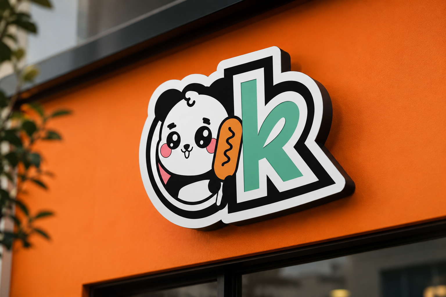
A playful and recognizable brand identity designed to stand out instantly.
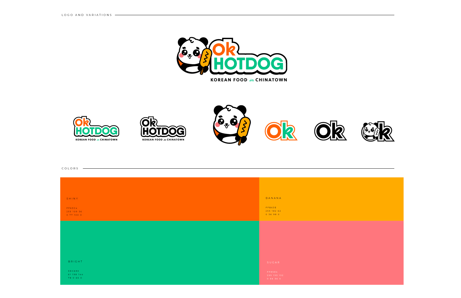
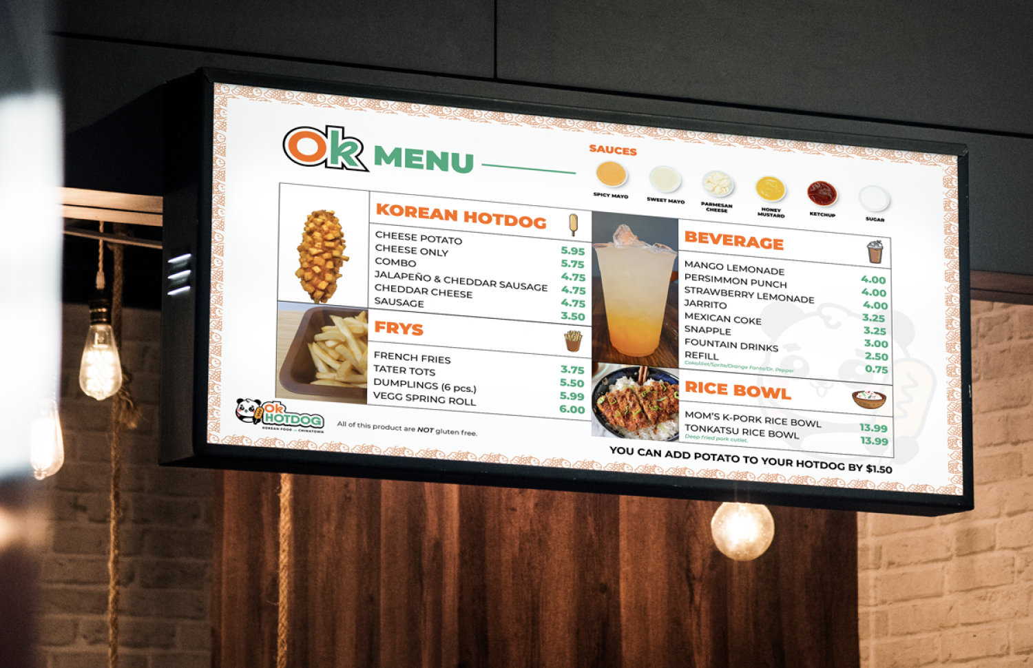
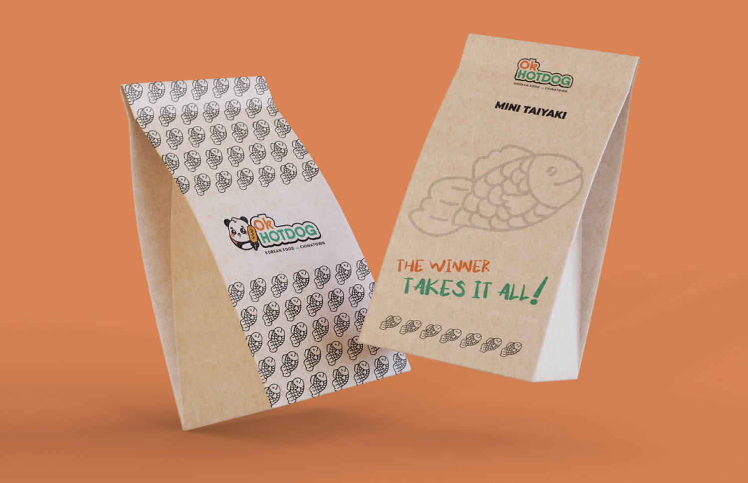
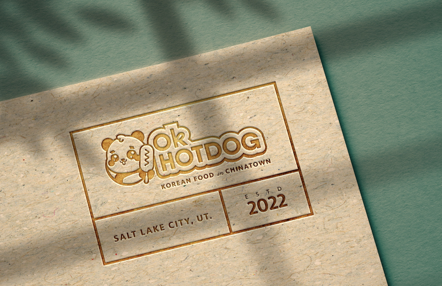
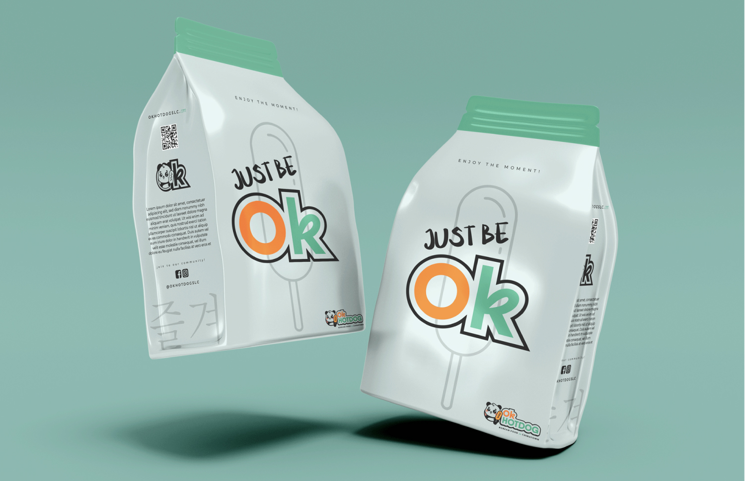
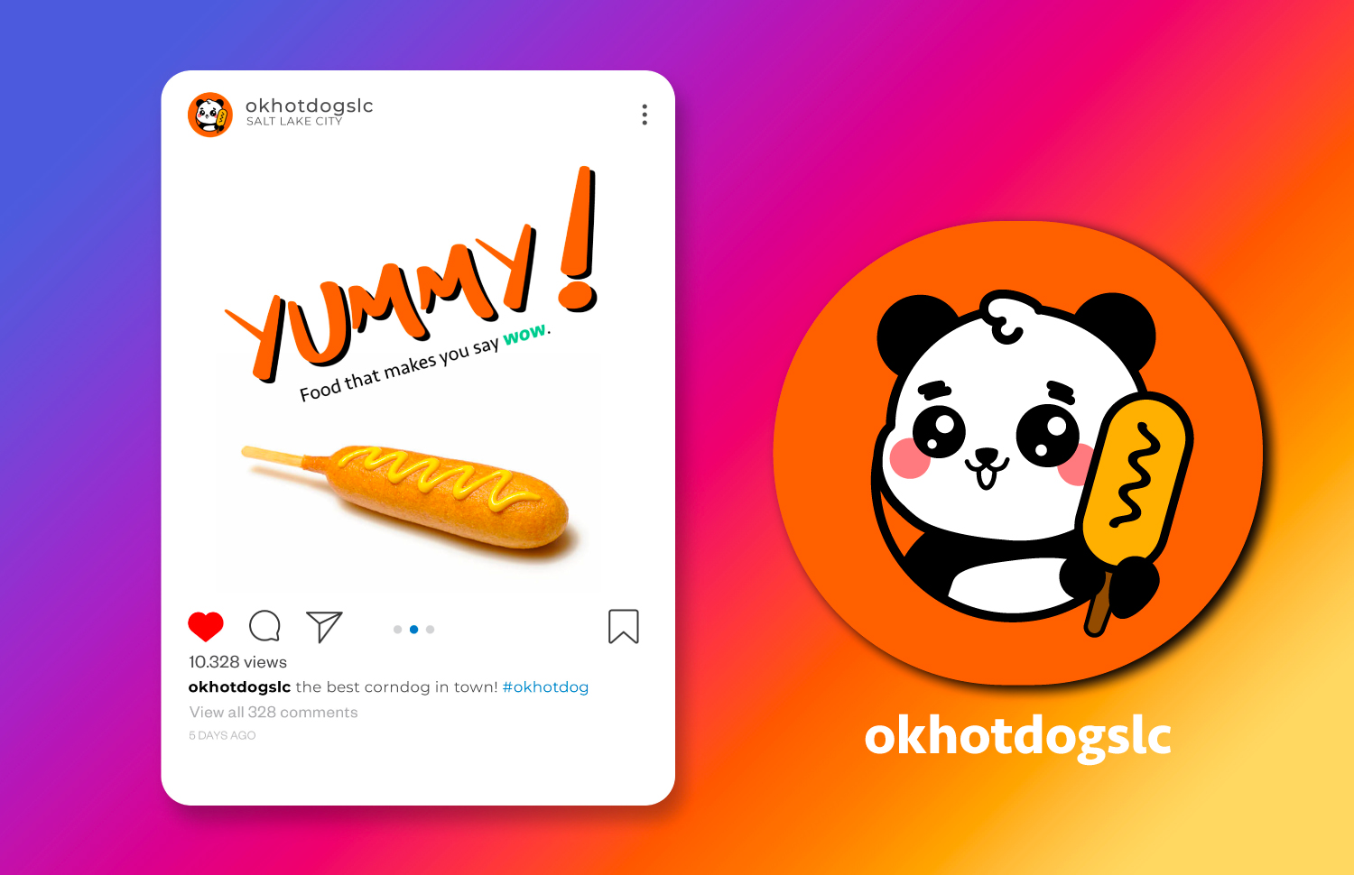
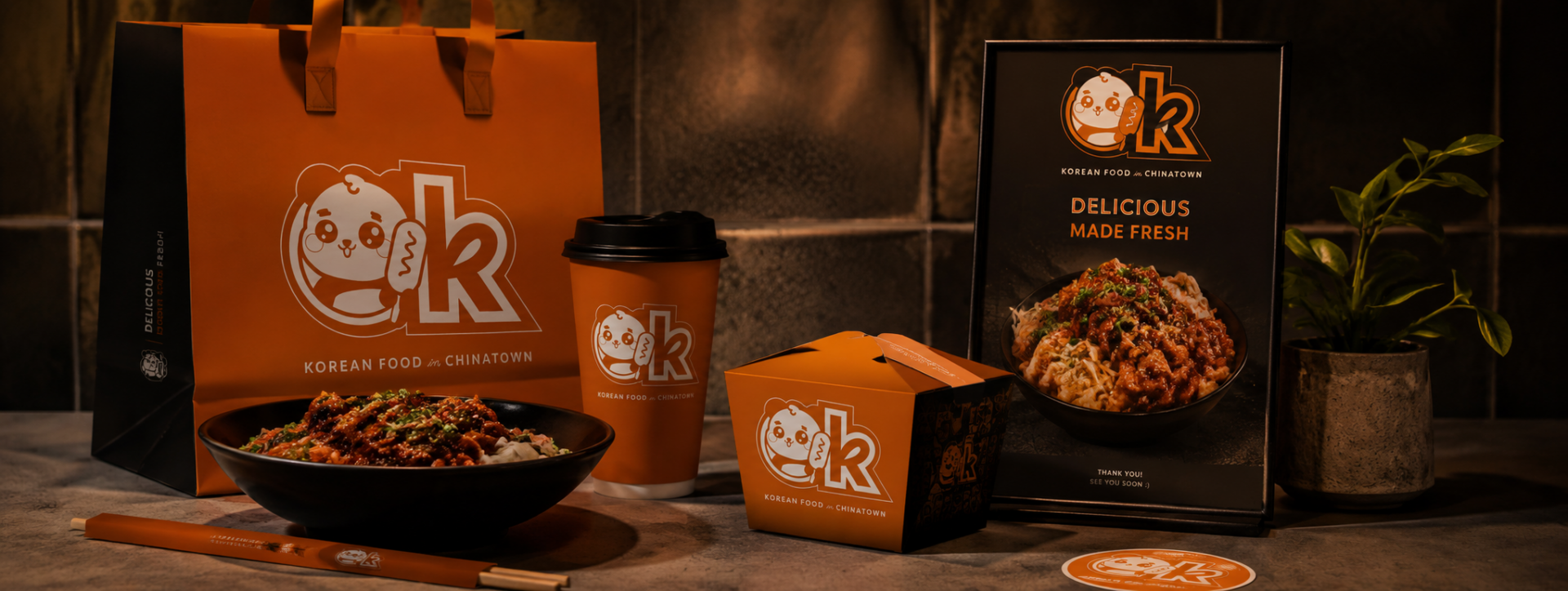
OK Hotdog was built to feel bold, fun, and visually memorable while still maintaining a clean and modern aesthetic inspired by Korean street food culture. The goal was to create a strong visual identity that could translate naturally across packaging, menu design, photography, and social media.
What I did
Brand identity design, logo development, custom illustrations, visual direction, menu photography, branded assets, and content creation focused on building a cohesive and highly recognizable restaurant experience.
Why it worked
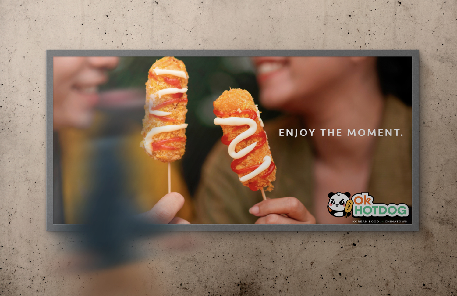
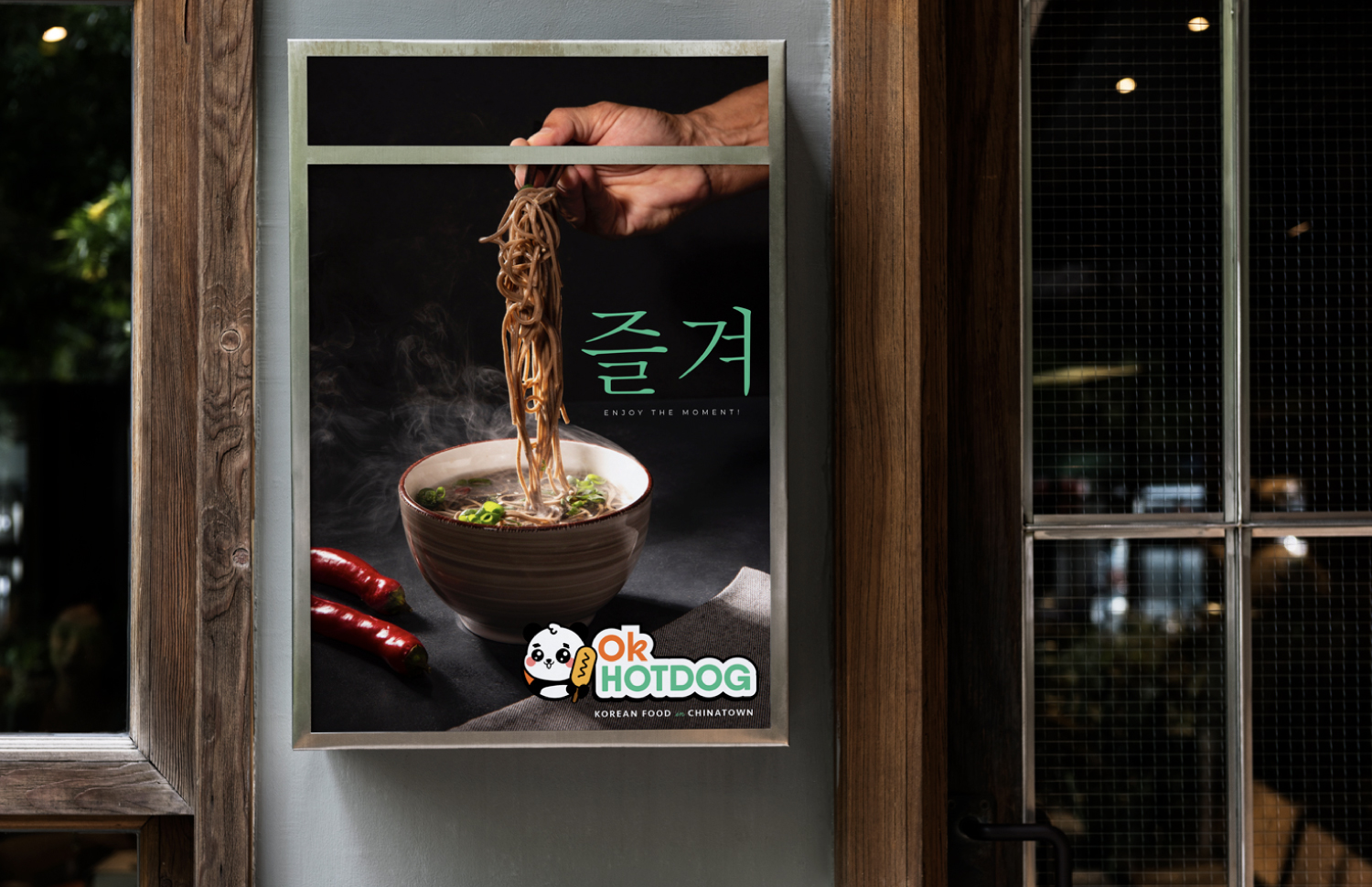
The project successfully blended playful illustration, strong typography, and vibrant visual storytelling to create a brand that felt unique and instantly identifiable. By combining character-driven branding with clean food photography and cohesive visuals, the restaurant achieved a stronger personality and a more engaging customer experience online and in-store.
Value for the brand
The collaboration helped establish OK Hotdog as a visually distinctive restaurant with a memorable identity system that extended across every customer touchpoint. From illustrations to menu photography, the project strengthened brand recognition, improved presentation, and created a more cohesive visual experience for marketing, packaging, and social media.


EXPLORE MORE PROJECTS